Investing.com
Investing.com’s marketing pages had grown into dozens of templates, each telling a slightly different story about the same product.
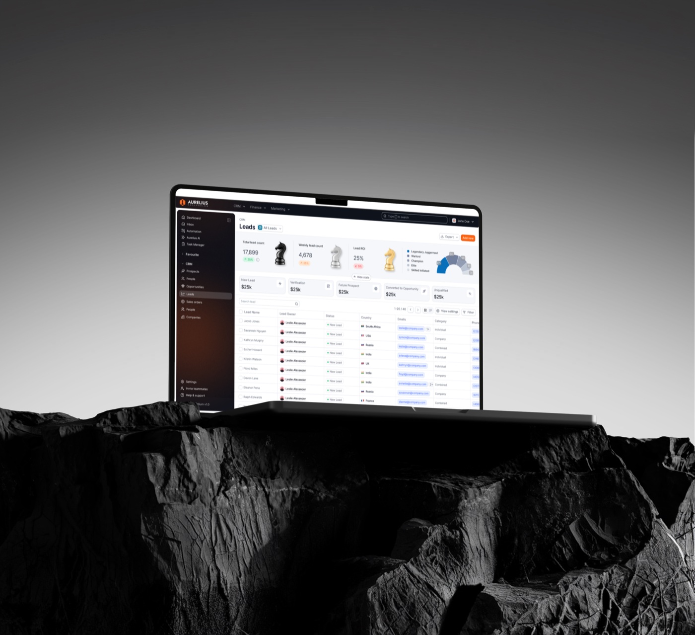
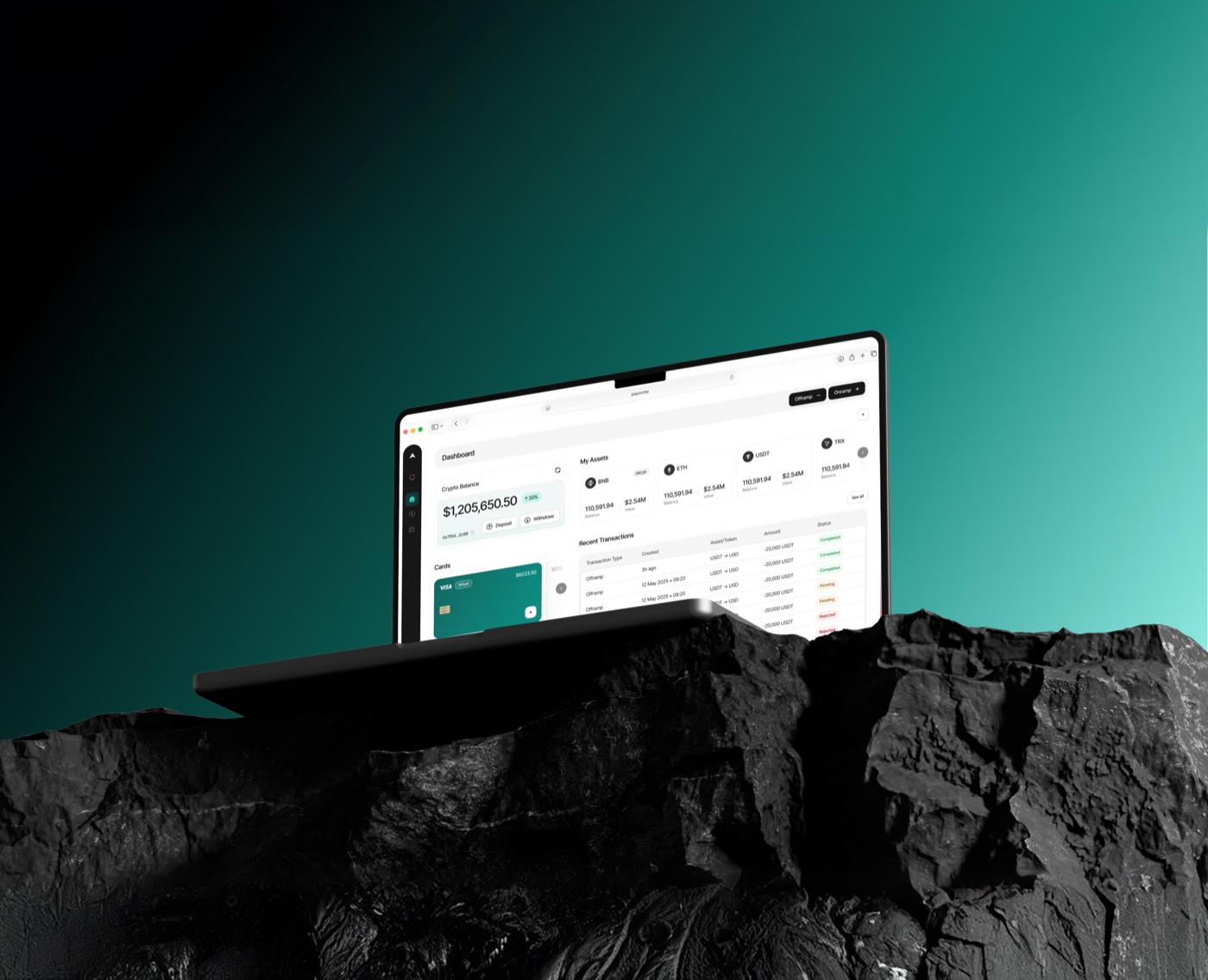
We rebuilt the landing system around one story per page and a component set the marketing team edits without a designer.
Industry
Fintech, Financial Media
Services
Website, Design System, Marketing
2025
Designers
 Minindu
 Sandruwan
Developer
 Iroshan
Intro
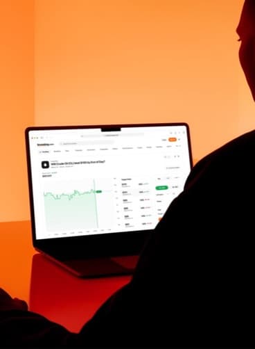
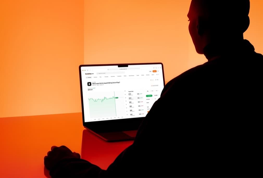
The opportunity
One story per page, and a page for every story
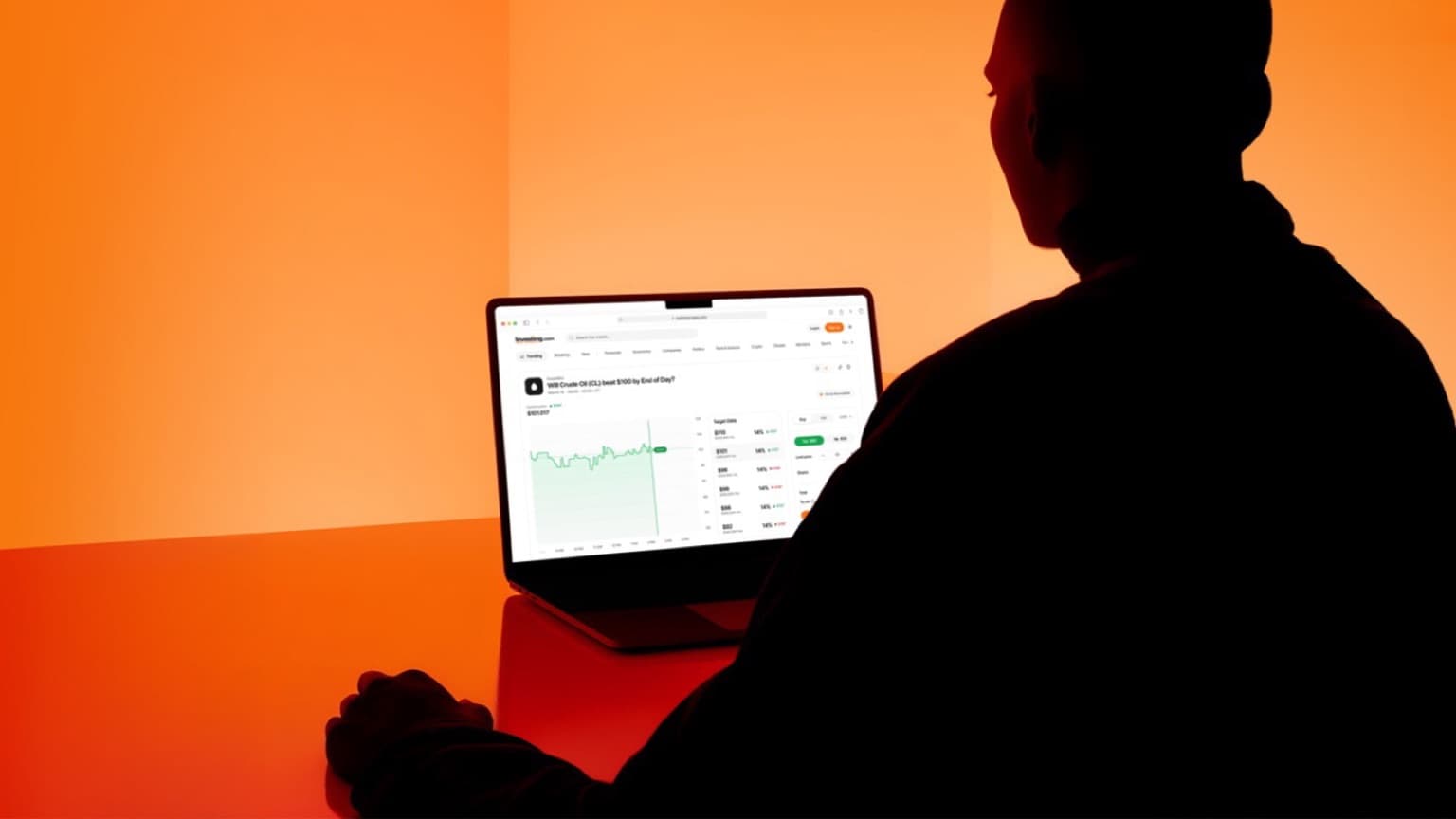
Every campaign got a new template, and every template drifted. The pages that converted best all did the same thing: one promise, proof, one action. The system just had to make that the default.
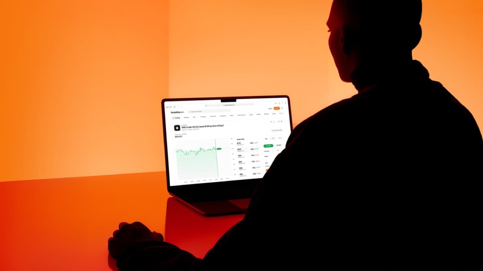
Highlights
Highlight #1
A block library, not a template.
Hero, proof, benefit, action. Marketing assembles a page from a dozen blocks in an afternoon, and every combination lands on the same grid.
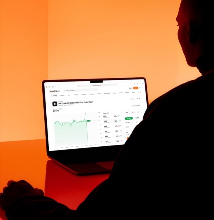
Highlight #2
Edits without a designer.
Copy, imagery and order are editable in the CMS. The design holds because the blocks do, not because someone checks.
Design approach
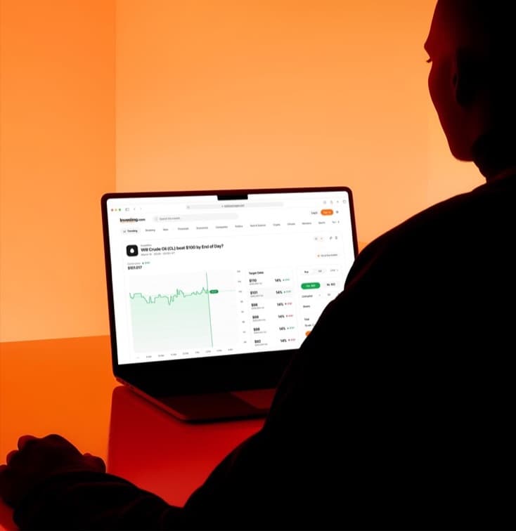
Find the page that works, then make it the only kind
We audited forty pages against their conversion data, kept the anatomy of the winners and rebuilt it as a block system with the flexibility marketing actually used, and none they didn’t.
Background
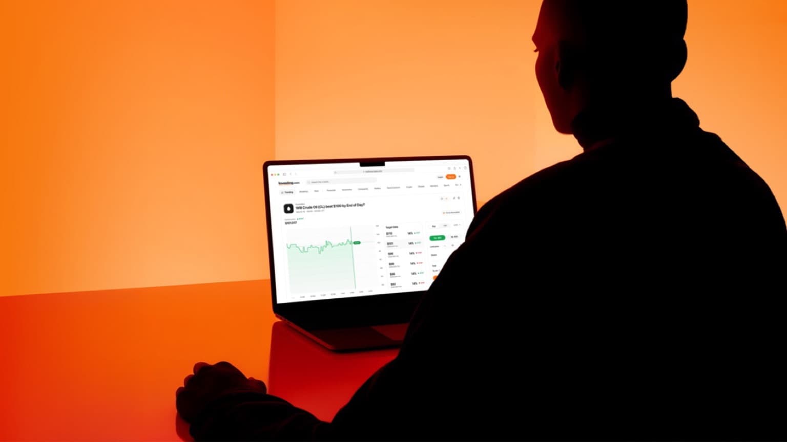
Where it all started
Investing.com’s marketing team was shipping pages faster than design could review them, and the brand was paying for it.
The brief was a landing system that let marketing move at its own pace without the pages drifting apart.
Process
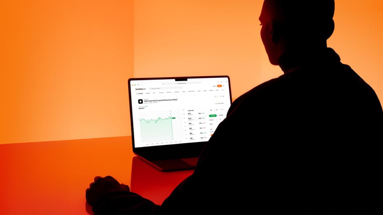
Let the data pick the anatomy.
Forty pages, one spreadsheet: what each page did, in what order, and how it converted. The winners shared a shape. We built that shape as blocks and retired the rest.
Focus areas:
- 1. Standardise the anatomy that converts.
- 2. Hand marketing an editor, not a Figma file.
Design execution
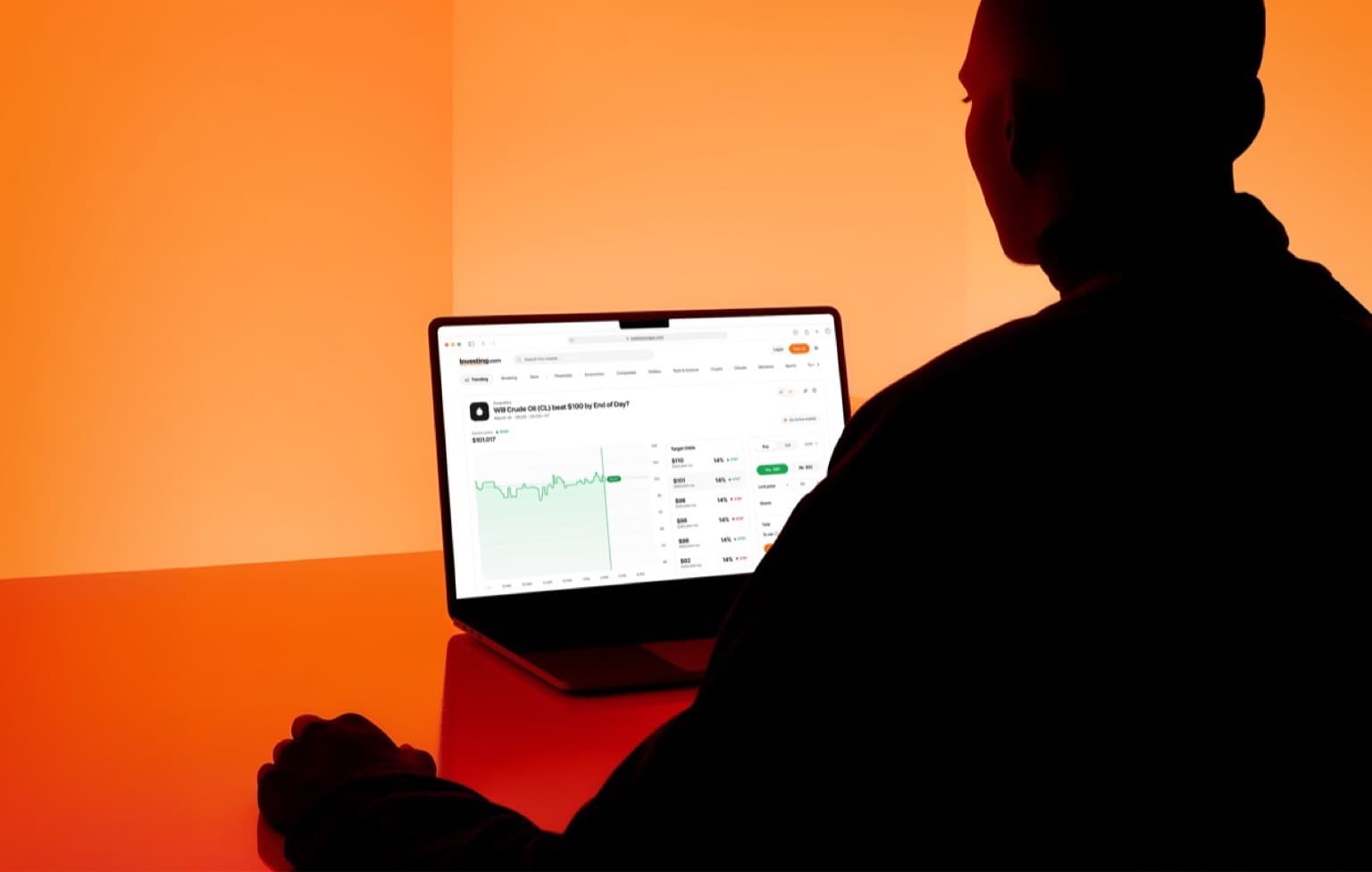
Blocks in the CMS, pages in an afternoon.
We built the block library into the CMS with the engineering team and migrated the top twenty pages first. Demo requests were up 23% within sixty days.
Key Learnings
- Let conversion data choose the layout. The best pages already agreed; the system only had to listen.
- Constrain the blocks, free the content. Marketing moved faster with fewer choices, not more.
- Ship the editor with the design. A system nobody can edit is a template with extra steps.
Got a project or product idea? Let’s bring it to life.
Reach out to hello@haux.studio to get started on yours.