Aurelius
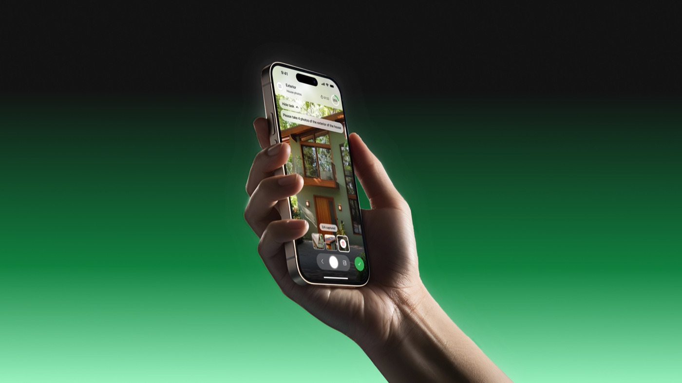
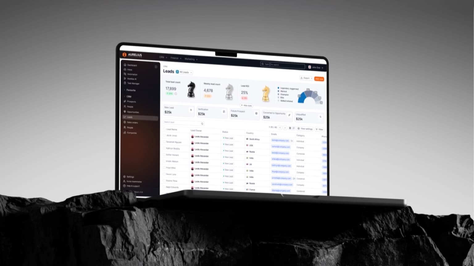
Aurelius runs operations for field teams: jobs, photos, checklists and sign-off, all from a phone on site.
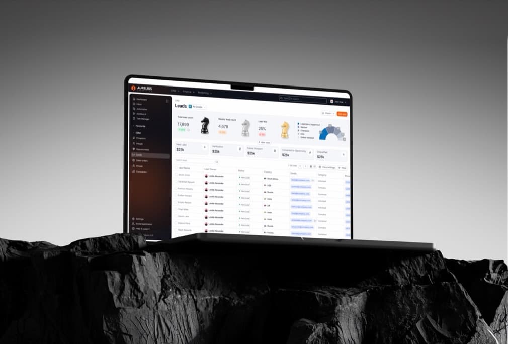
We rebuilt the brand from the wordmark up — type, colour and a component language that carried straight into the product and the pitch deck.
Industry
SaaS, Field Operations
Services
Brand Identity, Design System, Product Design
2025
Designers
 Sandruwan
 Thinuka
Developer
 Iroshan
Intro
The opportunity
One identity for the site, the app and the deck
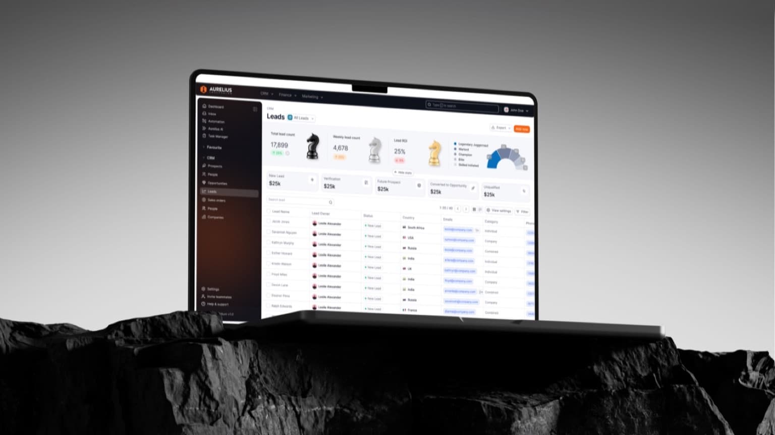
Aurelius had three looks: a logo from the first pitch, an app that had grown its own palette, and a deck that borrowed from both. Customers saw a different company at every touchpoint.
Highlights
Highlight #1
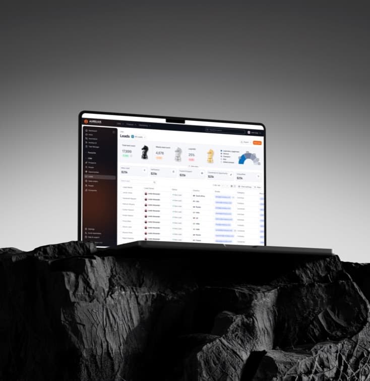
A wordmark built to live in a corner.
The mark had to work at 16px in an app bar and on the side of a van. We drew it for the small case first and let the large one follow.
Highlight #2
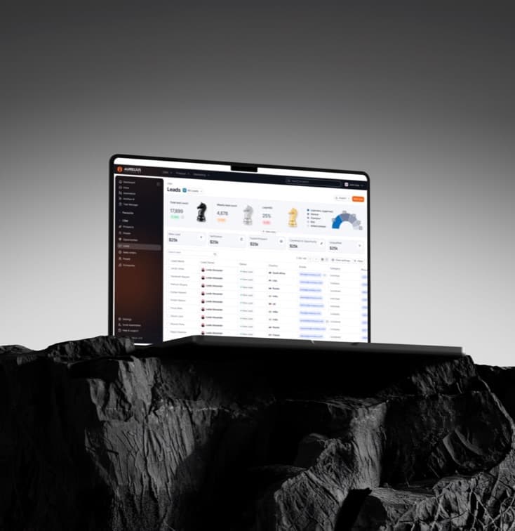
Colour that survives a job site.
A warm neutral base with one working orange, tested against sunlight, gloves and a cracked screen — the conditions the app actually meets.
Design approach
Brand as the product's component language
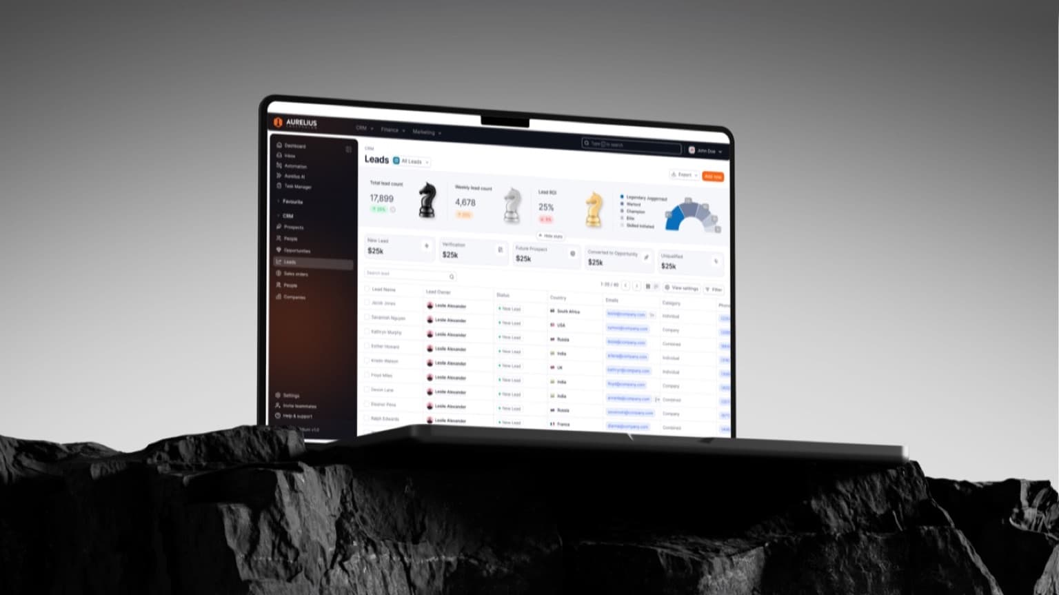
Rather than a brand book that lived beside the product, we designed the identity as tokens: type scale, colour roles and radii that dropped straight into the app’s design system and the deck template.
Background
Where it all started
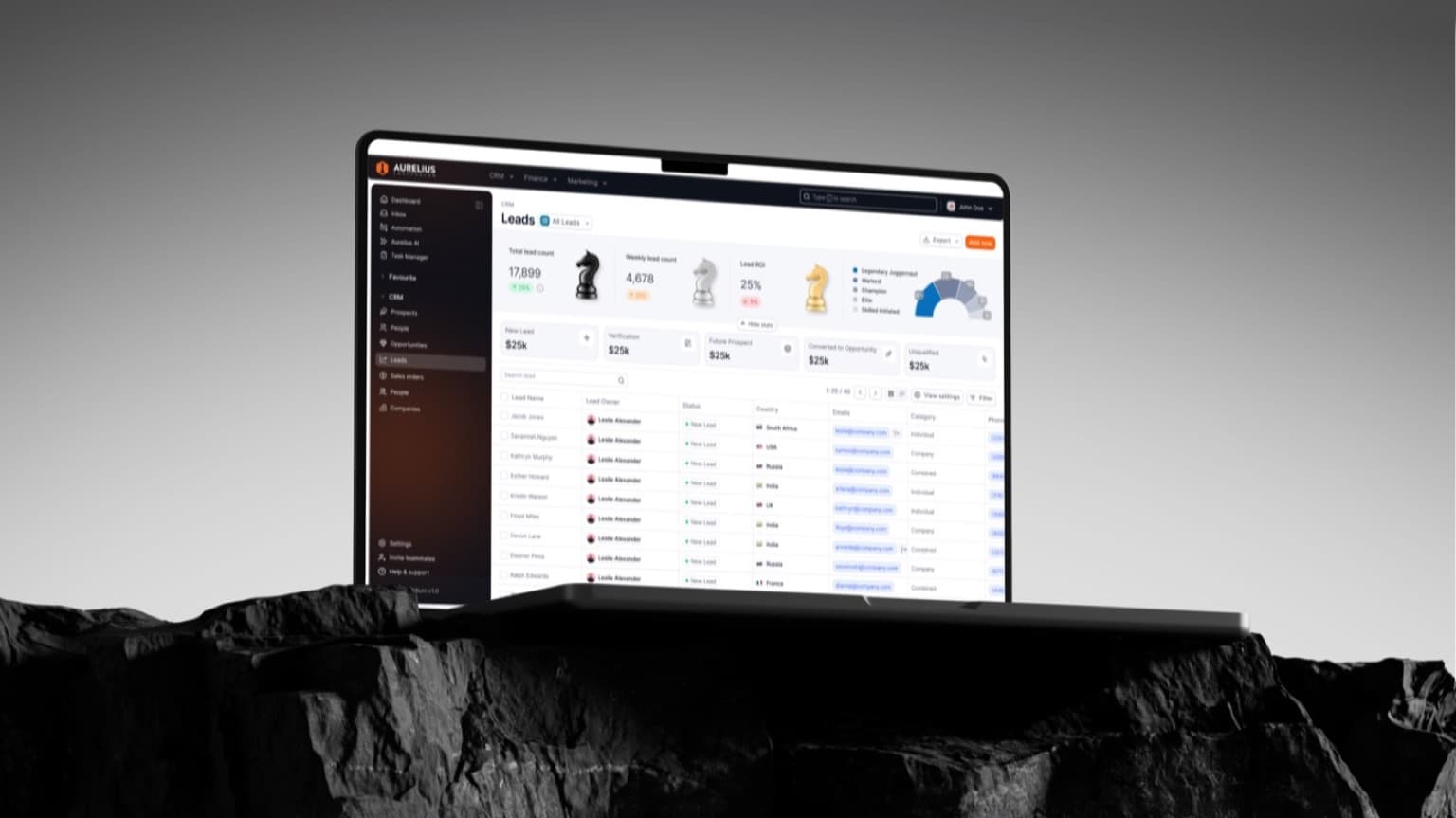
Aurelius was raising and rebuilding its app at the same time, and the brand was the thing both projects kept tripping over.
The brief was a single identity that could ship in the app, on the website and in the deck inside four weeks.
Process
Start where the brand is smallest.
We audited every place the mark appeared, from the app bar to the invoice footer, and designed for the tightest one. The rest scaled up from there.
Focus areas:
- 1. Draw the mark for the 16px case first.
- 2. Ship the identity as tokens the product can consume.
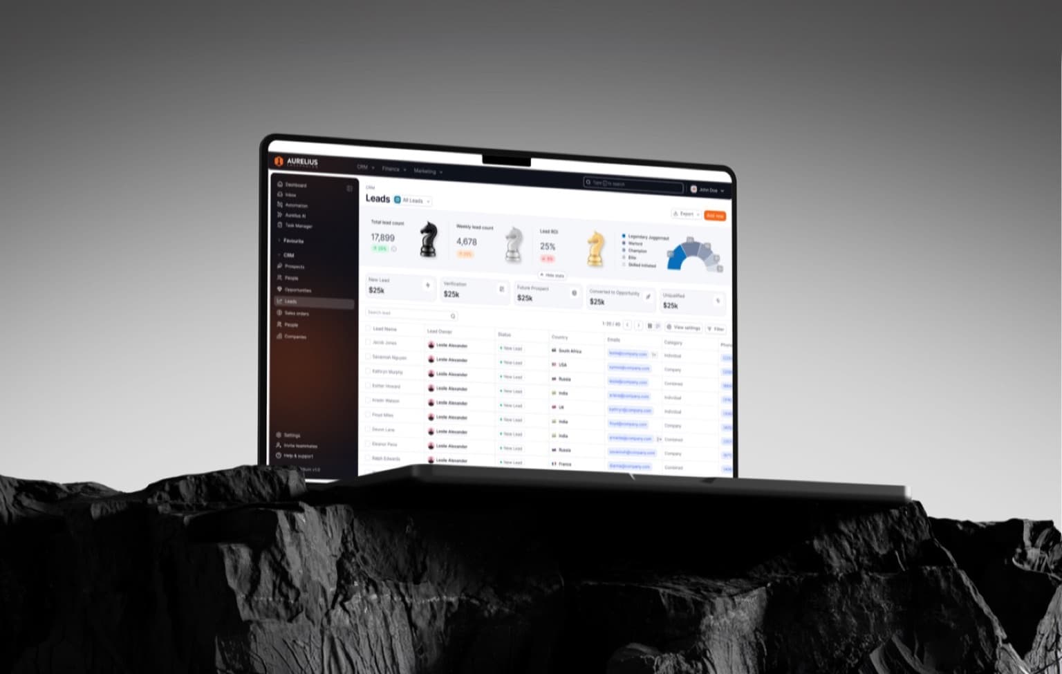
Design execution
From wordmark to shipped screens.
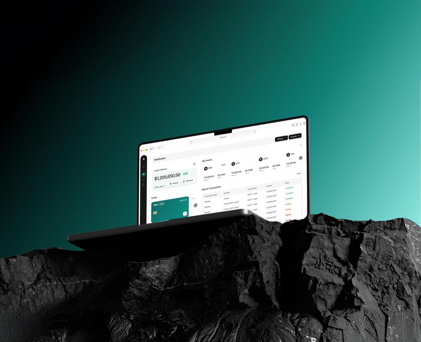
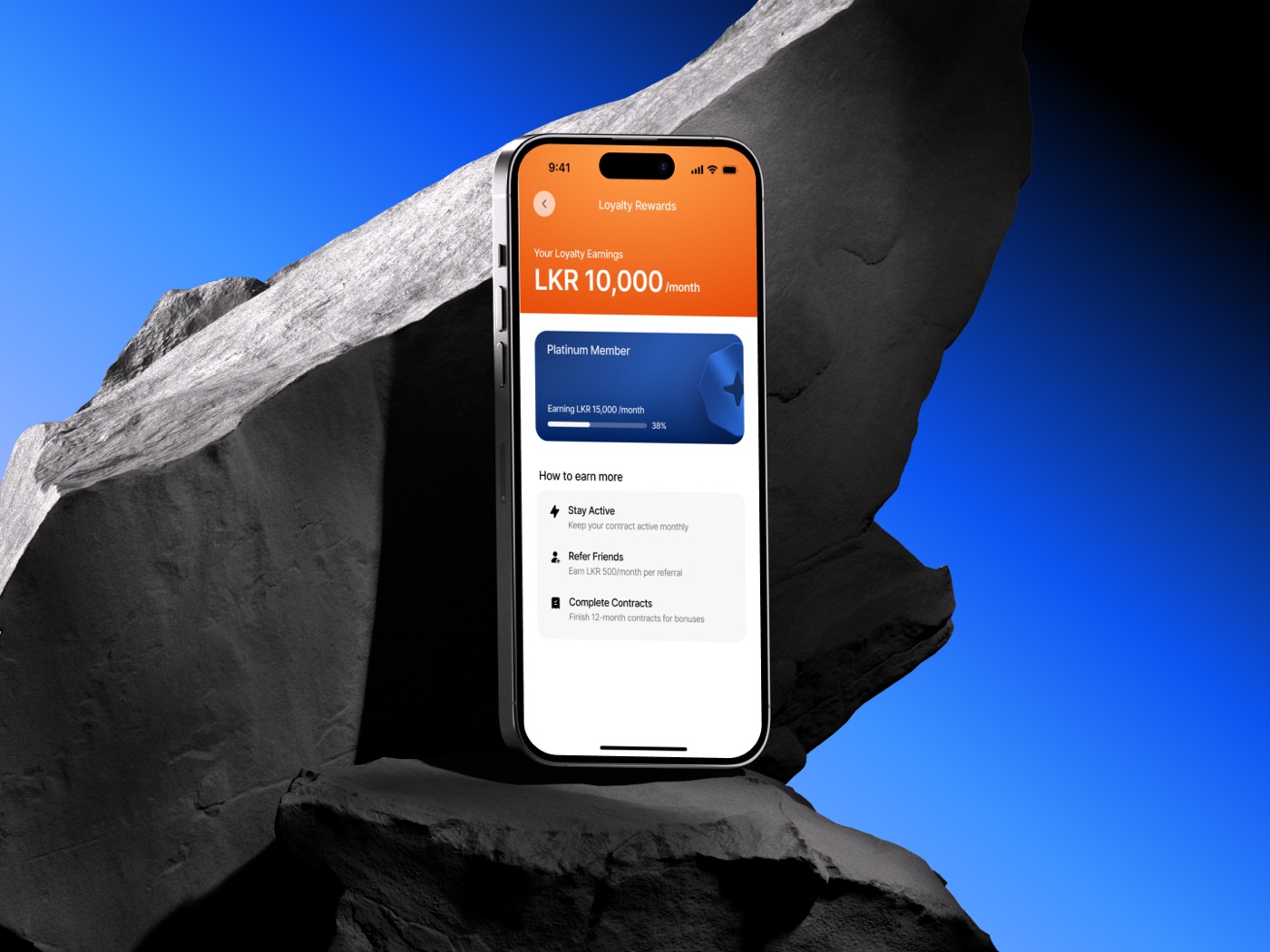
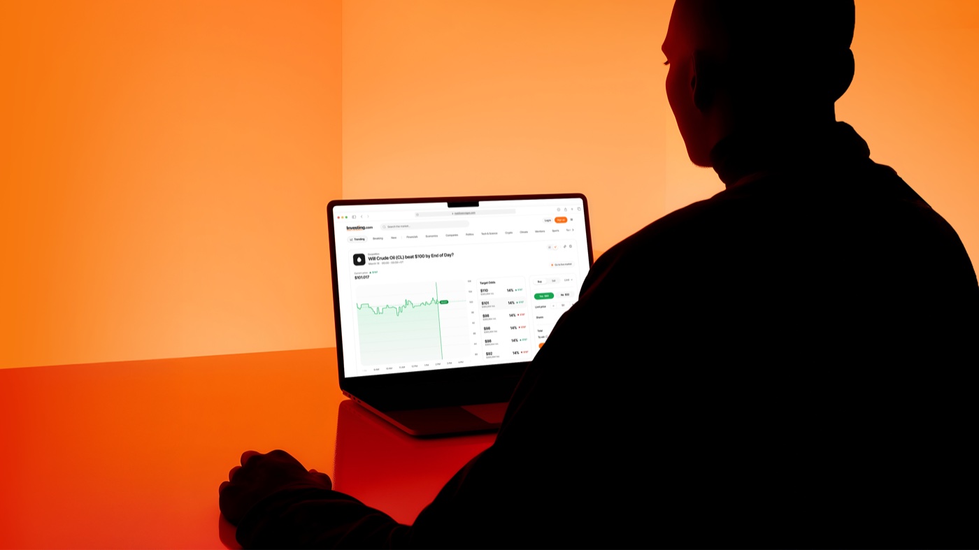
The identity landed in the app, the site and the deck in the same week. The rebrand shipped in four weeks, with the product team pulling tokens rather than waiting on assets.
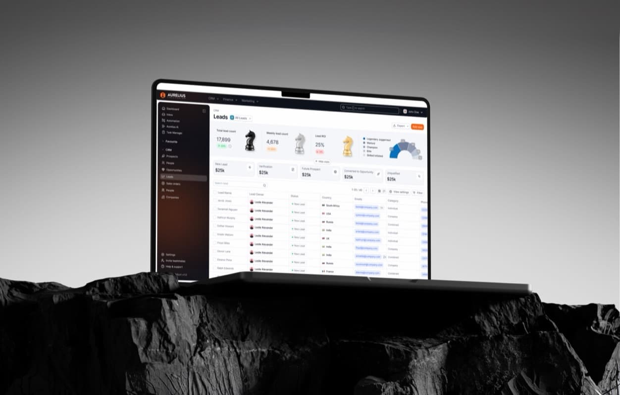
Key Learnings
- Design the small case first. A mark that works at 16px works everywhere; the reverse is rarely true.
- Tokens beat brand books. The identity stuck because engineers could use it without asking.
- Test colour in the field. Sunlight and gloves found problems a monitor never would.
Got a project or product idea? Let’s bring it to life.
Reach out to hello@haux.studio to get started on yours.