Payonite
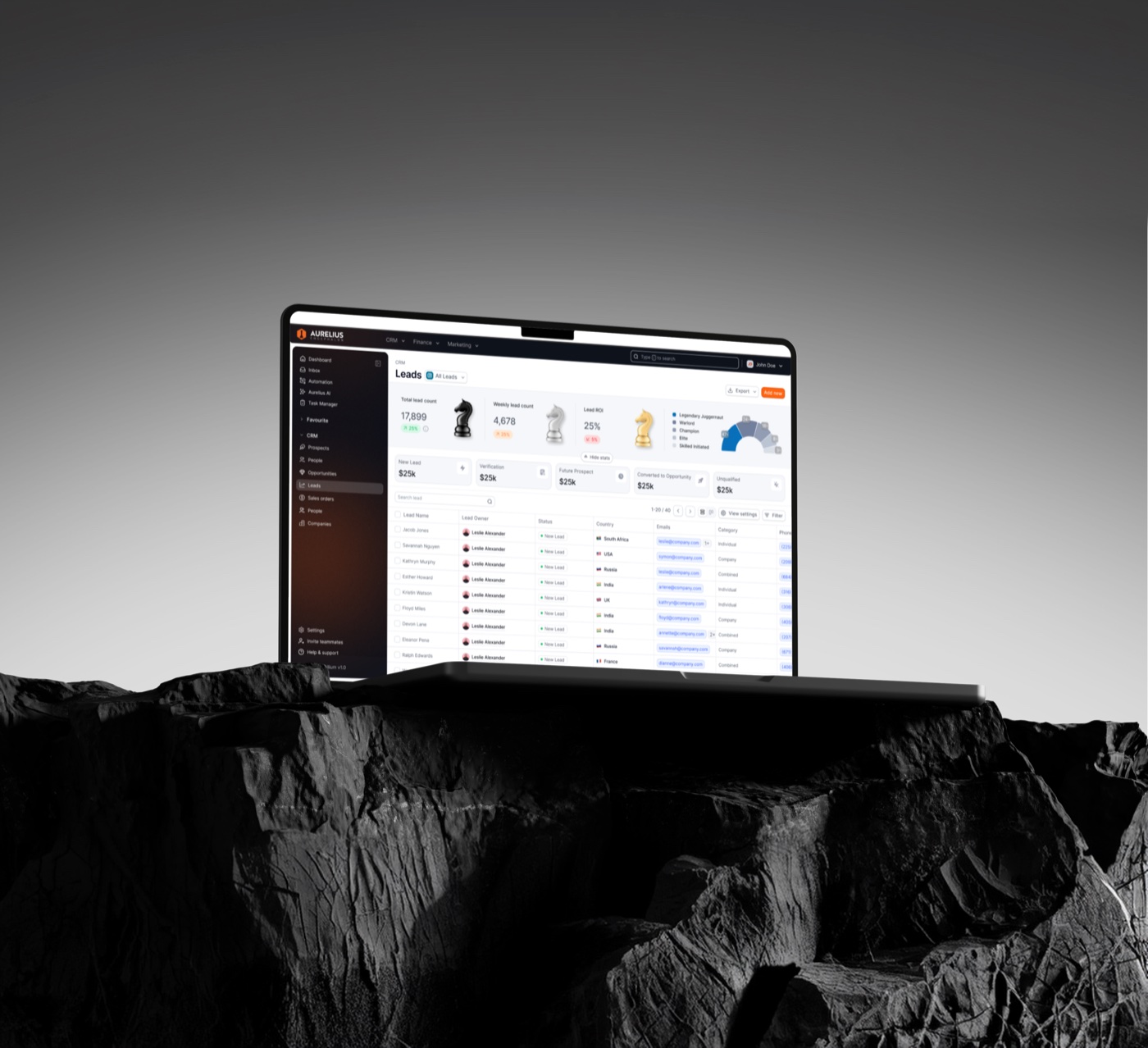
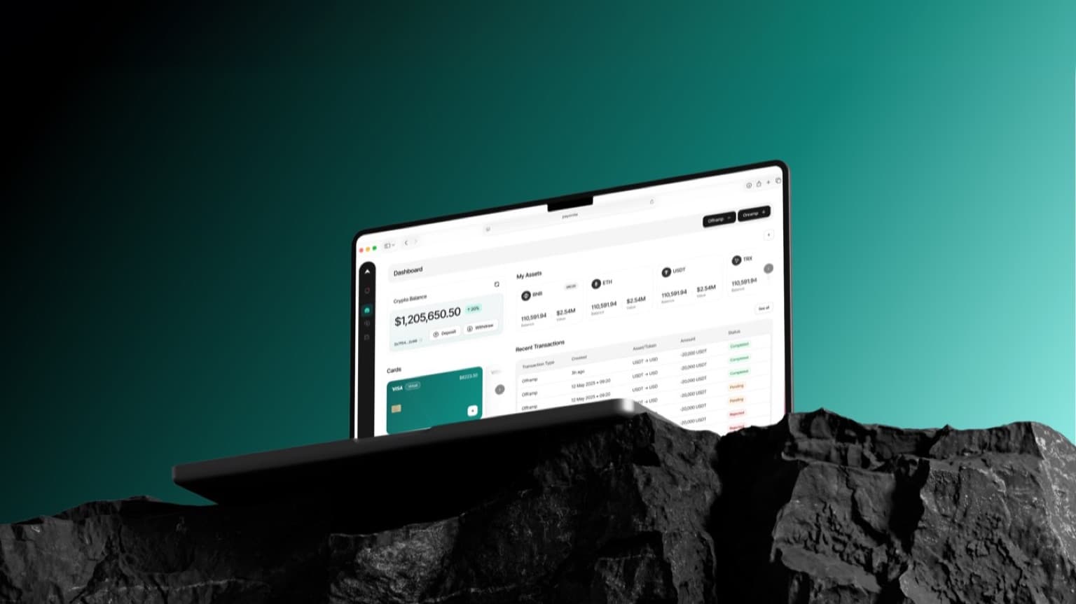
Payonite gives finance teams one place to hold, move and report on crypto treasury, without the spreadsheet glue that usually sits around it.
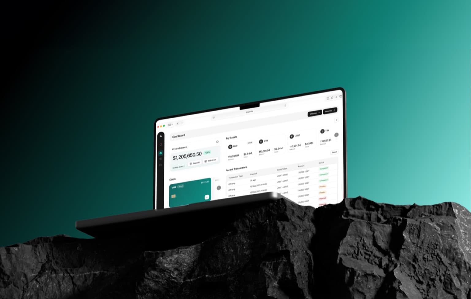
We redesigned the core product from eleven screens down to two and delivered a design system the in-house team still ships from.
Industry
Fintech, Crypto Treasury
Services
Product Design, Design System, Web App
2025
Designers
 Sandruwan
 Minindu
Developer
 Iroshan
Intro
The opportunity
Turning eleven screens of treasury into two
Every transfer meant a tour through wallets, approvals and reporting screens. Finance teams wanted to see their position and act on it in one place — and support tickets said the same thing.
Highlights
Highlight #1
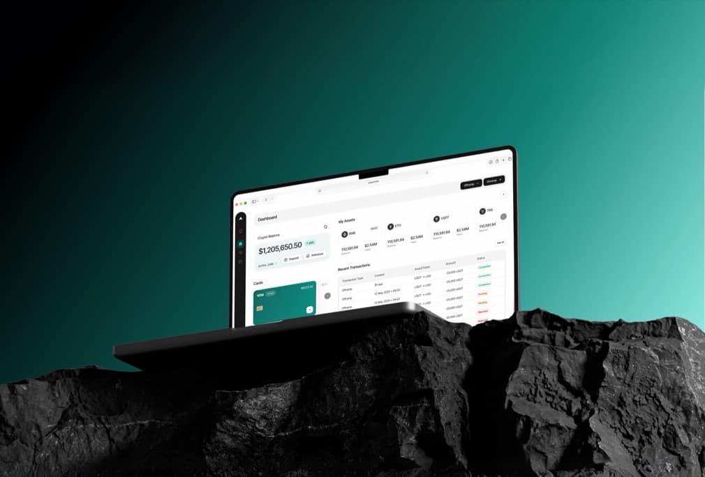
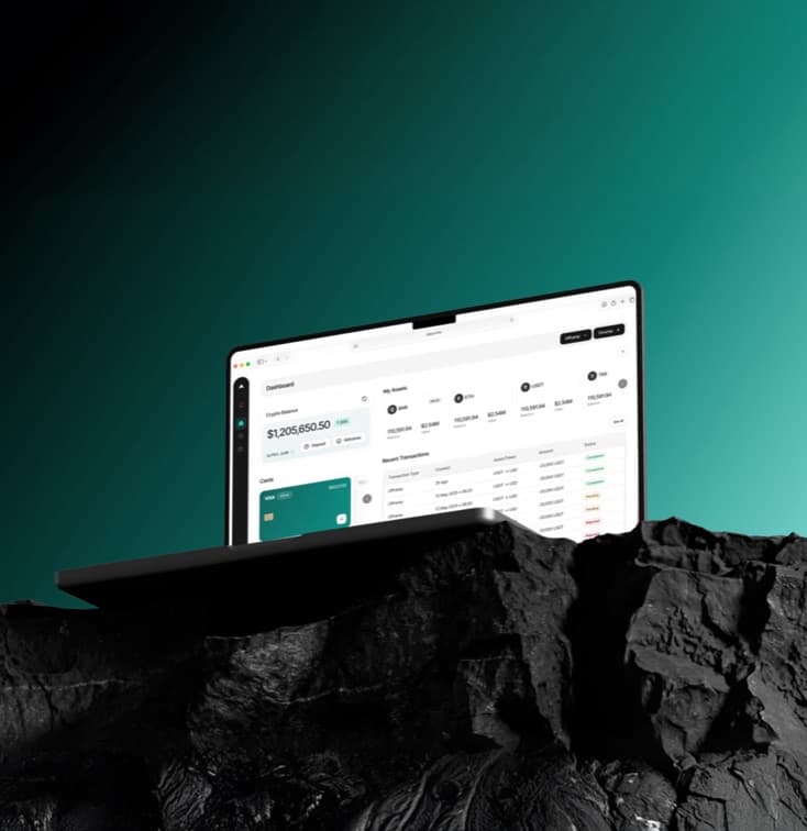
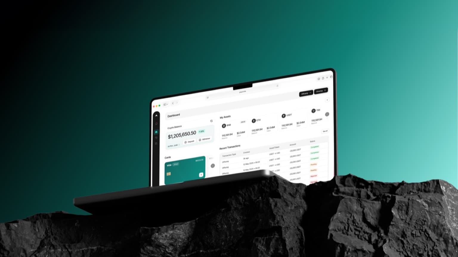
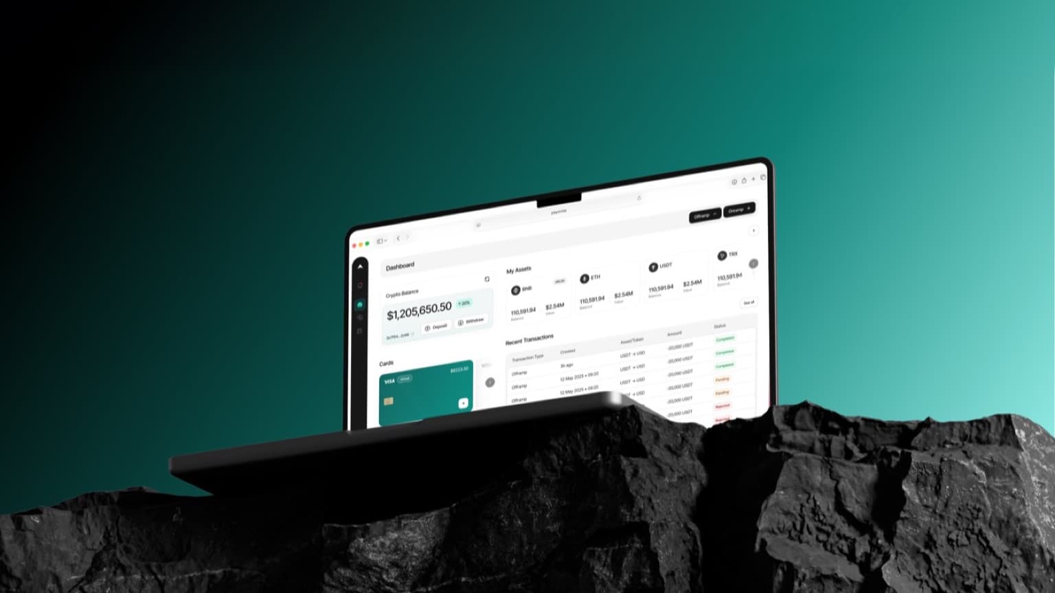
One view of the whole treasury.
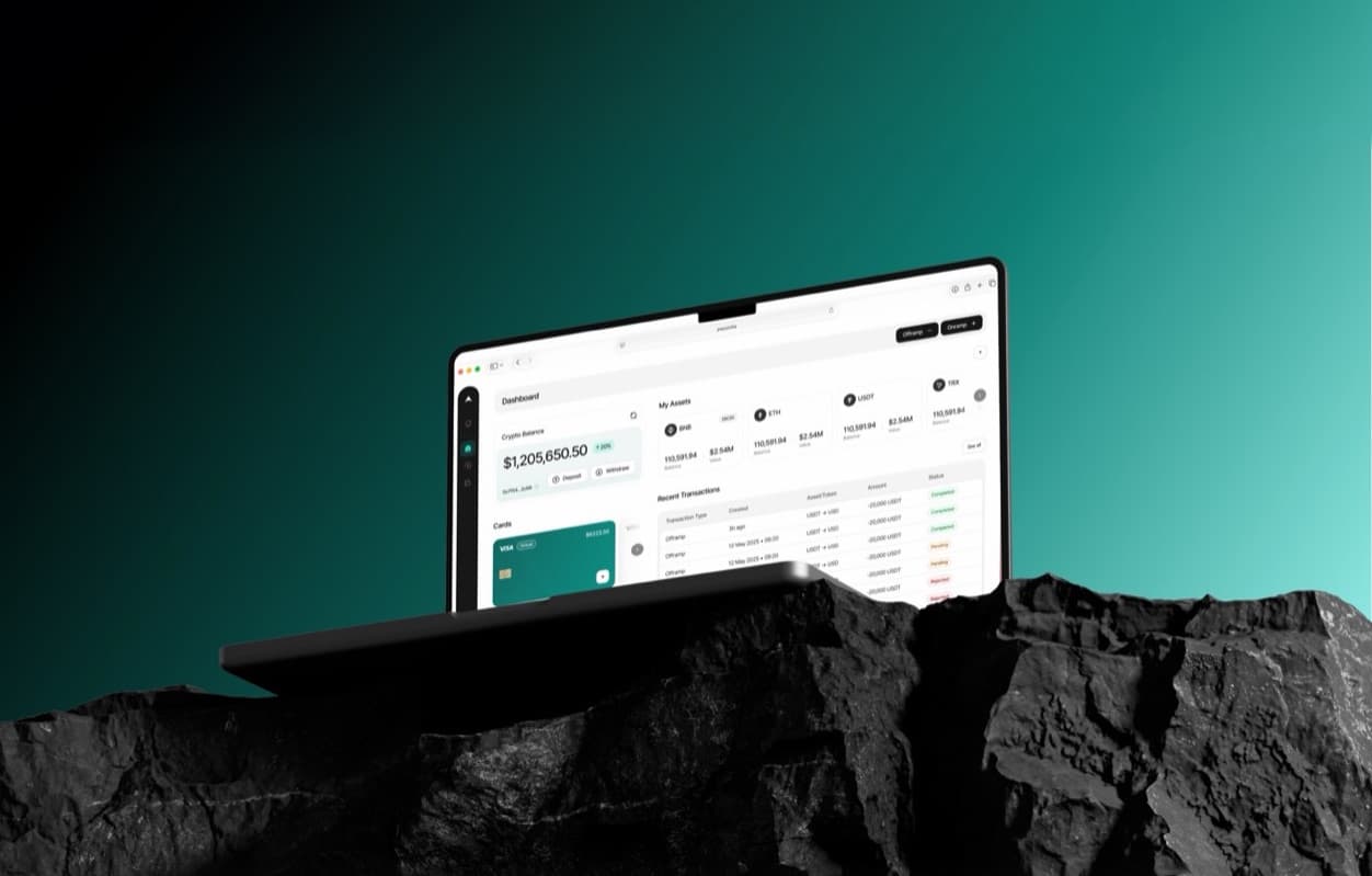
Balances, pending approvals and the last week of movement sit on one screen, so the daily check takes a glance instead of a walk through the product.
Highlight #2
A design system the team ships from.
Every component in the redesign landed in a Figma library and a matching code kit, so the in-house team could keep building without a designer in the loop.
Design approach
Design the two screens people actually live in
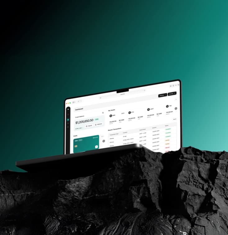
We mapped what the team did every day against what the product made them do, then folded the eleven screens into an overview and a transaction detail. Everything else became a panel or a step inside those two.
Background
Where it all started
Payonite had grown feature by feature, and each feature had brought its own screen. The product worked, but nobody could explain it in a sentence.
The brief was a product finance teams would trust at a glance, and a system that would stop the sprawl from coming back.
Process
Following the money through the product.
We shadowed treasury runs with three customer teams and logged every screen change. The pattern was clear: most of the product was travel between two places.
Focus areas:
- 1. Cut the daily treasury check to a single screen.
- 2. Give the in-house team a system that holds the line after launch.
Design execution
Two screens, one system.
Working alongside the Payonite engineers, we shipped the overview and transaction detail first, then rolled the design system out across the rest of the product over the following quarter.
Key Learnings
- Count the screens. The number of places a task touches is the clearest measure of how a product feels, and the easiest one to cut.
- A design system is a handover, not a deliverable. It earned its keep only once the in-house team was shipping from it without us.
- Support tickets are research. The 41% drop in tickets was the same signal the interviews gave, just cheaper to collect.
Got a project or product idea? Let’s bring it to life.
Reach out to hello@haux.studio to get started on yours.